Banco Santander Madrid, Spain

Shaded and secured

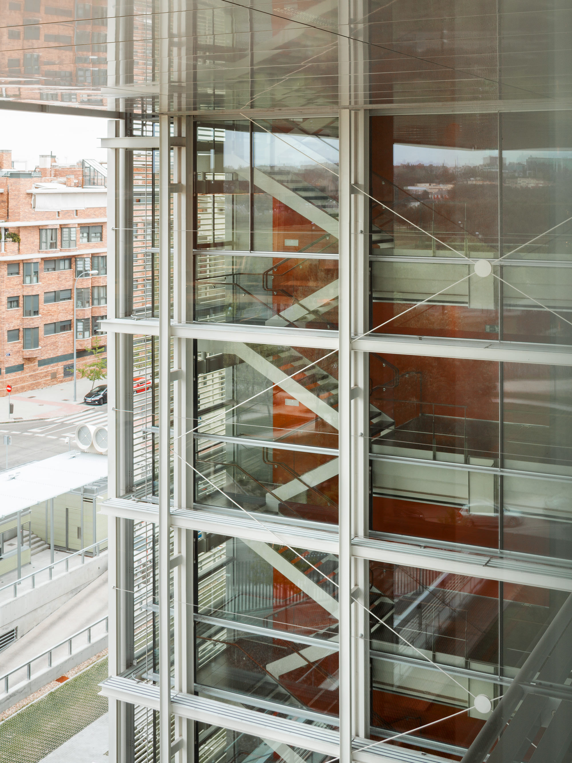
The new headquarters of Banco Santander in the Spanish capital makes an imposing mark on the city’s skyline. The outer façade has a barred effect which screens, protects and shades the interior, while the floor-to-ceiling glazed inner façades capture the light and give the building a sense of spaciousness. The strict security standards were met using the VISS Fire and Janisol C4 systems.

The new headquarters of Banco Santander, formerly Banco Popular, is located in Madrid’s Hortaleza district. With easy access from the nearby motorway exit, the seven- storey building on Calle Abelias soars skywards towards the hot sun of central Spain. The impressive building is centrally located in the semicircular plot of around 10,600 square metres.

The project was put to a competitive tender, in which seven teams proposed designs based on the preliminary plans. The studio Arquitectos Ayala from Madrid made the winning bid, supported by the MC2 Estudio de Ingeniería in the field of construction management. The bank’s vision for the building was one that would clearly communicate – in a way that would be recognisable to users and visitors – the company’s values of discretion, objectivity, strength, service and flexibility. The then Banco Popular also set three parameters as the basis for the design: the optimisation of surfaces and volumes, flexibility of use, as well as achieving LEED certification.
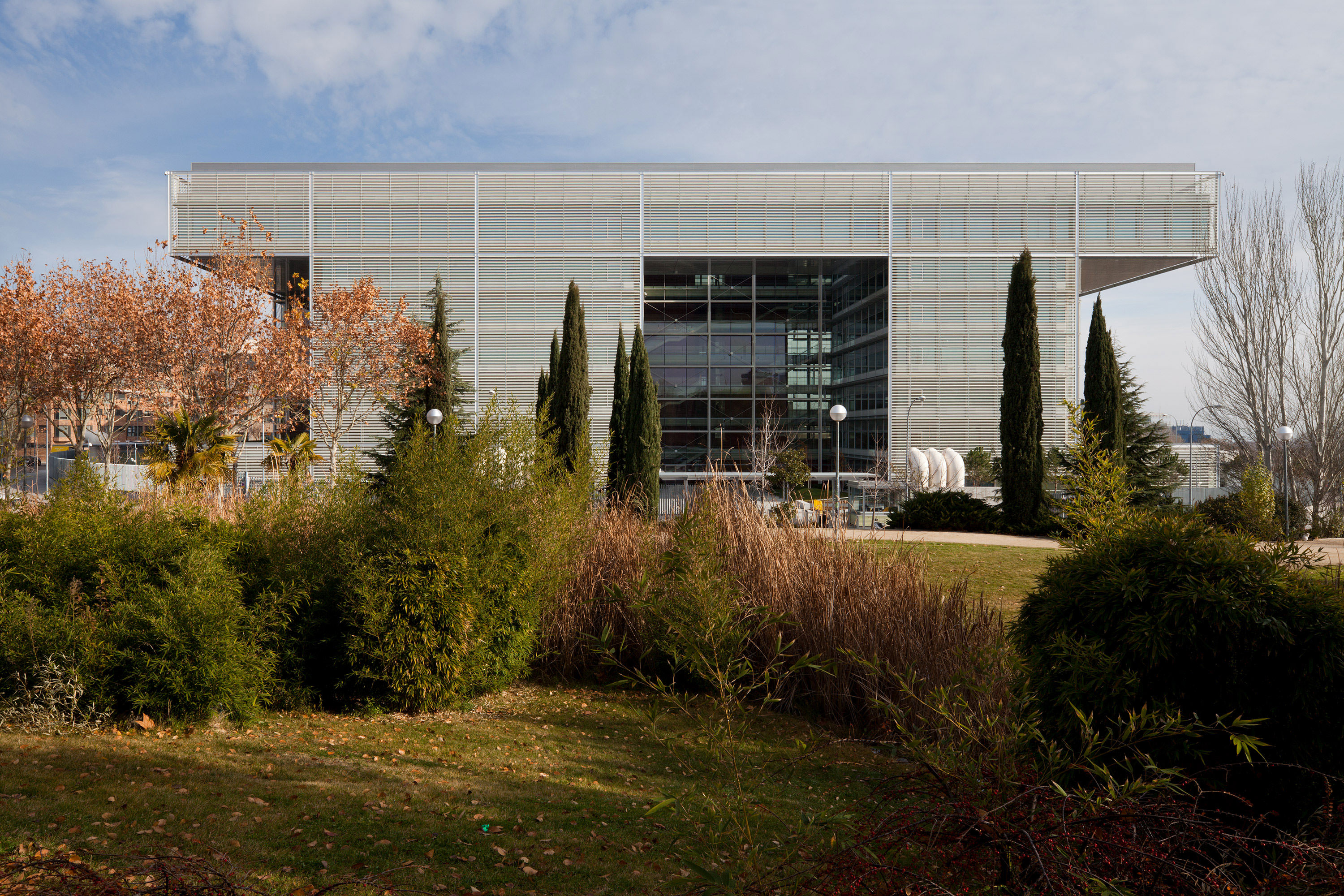
The ceramic coating on the solar reflector tubes in front of the outer façades catches the light and diffuses it into the building at a dimmed level.
16445
square metres of bright and airy work stations
7
-floors

An imposing openness

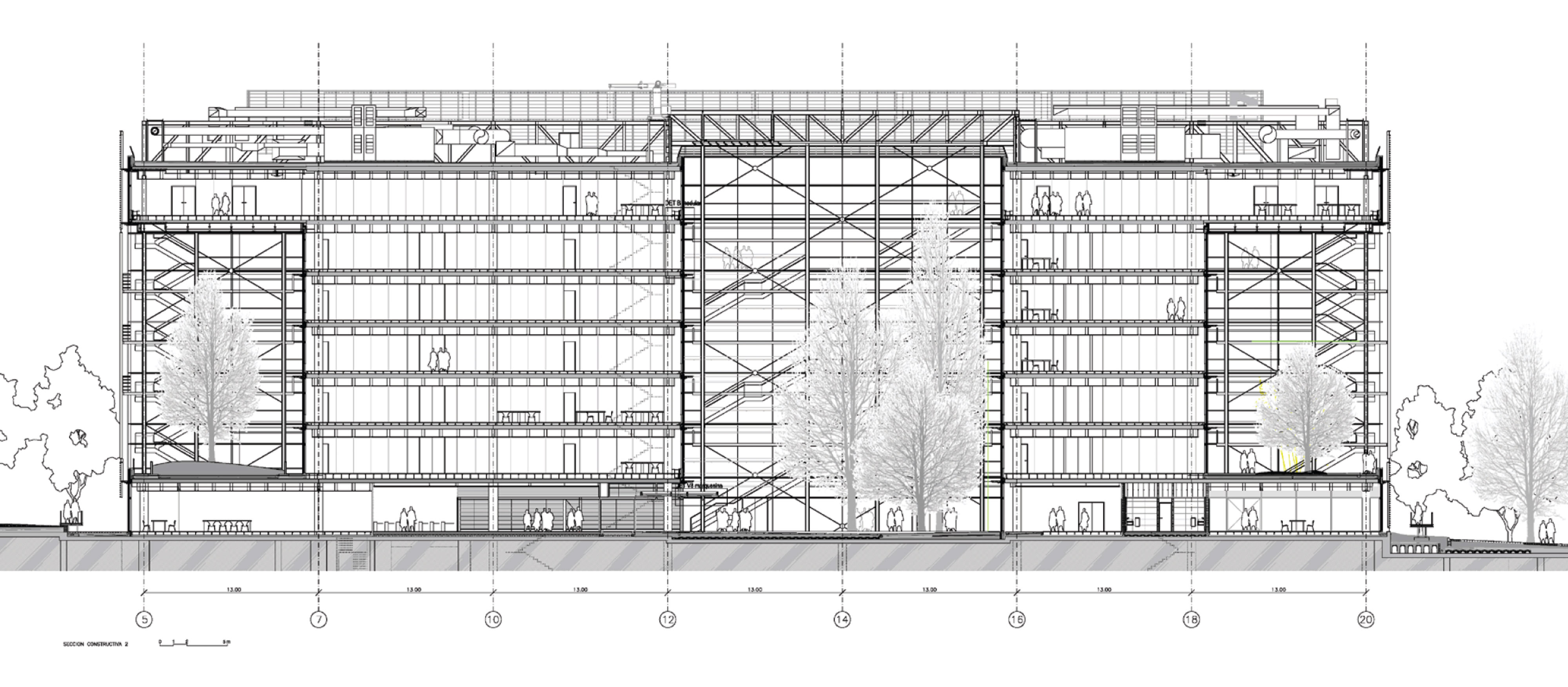
The entire premises is surrounded by with steel bars, with a security area on the periphery allowing selective access to the site. The floor plan includes three underground levels for the garage and facilities. The ground floor above is where the public areas are found, such as the spacious entrance, foyer, various meeting and conference rooms and office space. Additional office space is towered high on the six floors above. The result is a huge, blocky cuboid structure that – at 95 x 56 metres –is almost twice as long as it is deep. The massive structure is situated on a clear, readable grid, which is characterised by white steel beams and supports. This steel framework, which runs through the entire building, houses a series of open and closed units. These are arranged in a staggered sequence in order to capture more daylight and provide mutual shade.

With its barred façade, the new headquarters of Banco Santander has an austere, defensive look about it. And yet the building also has a certain openness, with a recess on the entrance side that extends six floors up from the ground floor and almost down to the central axis of the building. This recess draws daylight right into the interior of the building, covering several floors. The partially landscaped inner courtyard leads visitors to the central entrance area, which is in the exposed centre of the building.
Volume was also taken out of structure, with a six-storey recess in the front edges on both sides of the building. This allowed the façade surface to be increased, while also protecting the interior from direct sunlight. The rear side of the building is completely enclosed, apart from two square recesses spanning five storeys.

Open interior

The architects also created an open space right at the core of the building, where three large, landscaped atriums flood the building with daylight from the inside. This section of the building opens out into an open and transparent office space with 16,445 square metres of bright and airy work stations. The open design of the space promotes communication and encourages people to work together as a group. The structural design allowed for large distances between each steel support, meaning that the supports do not obstruct the work space. The grid of the supports is 13 x 7.80 metres and tests the limits of structural possibility thanks to its 30 centimetre-thick post-tensioned ceiling panels. The office space is accessed is via a spacious stairwell that is flooded with natural light, creating a bright meeting area that should encourage the use of stairs. Aside from saving energy, reducing the use of lifts also means the floors can be used more flexibly and creates more interaction between the different areas. Walkways, corridors and stairs situated next to the glazed façade mean those inside can see the hustle and bustle of life outside, and vice versa – although the sheer magnitude of the building gives it a life of its own.

Sun-proof façade

The façades of the building are glazed from floor to ceiling. In order to protect the rooms from the strong sunlight outside, the glass installed features a special type of sun protection. On the outside of the building, the construction of the building envelope features a a double- skin façade. The external façades are shielded from direct sunlight by means of horizontal pipes. The ceramic-coated pipes, each measuring six centimetres in diameter, are spaced in rows at a horizontal distance of 17 centimetres from one another. The pipes are held in place by vertical struts every 260 centimetres. These not only reflect solar radiation, but also have a distinctly industrial character that helps to reinforce the defensive look of the building. The ceramic coating of the solar reflector tubes catches and diffuses the light, thus creating a sort of dimming effect. This helps to ensure a controlled level of indirect sunlight that, depending on the angle of incidence, creates a soft play of colours inside the building.
In the centre of the structure around the inner courtyards, sun protection is provided by a series of vertical tubes at ceiling height, creating a sort of canopy. A comprehensive light control system uses blinds and light intensity monitoring to ensure the glare-free use of daylight and the efficient use of artificial light inside the building.

The glass façade is based on the tried-and-tested VISS system, with particular use of the VISS Basic Façade and VISS profile systems. This efficient and visually impressive system solution is designed to be mounted on any kind of support. This meant that the architects could create large expanses of uninterrupted surface when constructing the façades. Each floor has its own maintenance walkway, allowing for adequate maintenance of these huge glass surfaces. The new bank headquarters of Banco Santander is an imposing structure. The composition of the building’s volume with is atriums and recesses; the ingenious design of the façade, and the structural measures for sun-proofing, all serve to maximise the use of daylight while also minimising energy consumption. The result: the building achieved LEED certification with a rating level of no less than Gold. (GB)
On the entrance side, the cuboid structure opens up over several storeys, drawing indirect sunlight right into the interior of the building.
The architects designed a huge, blocky cuboid structure, positioned on a clear, readable grid.
Project details
Client
Banco Popular, Madrid (now: Banco Santander)
Architect
Metal work
INASUS S.L. , Lalín; Proinller, Madrid
ENAR, Madrid
Steel profile systems
photography
© Lluis Casals